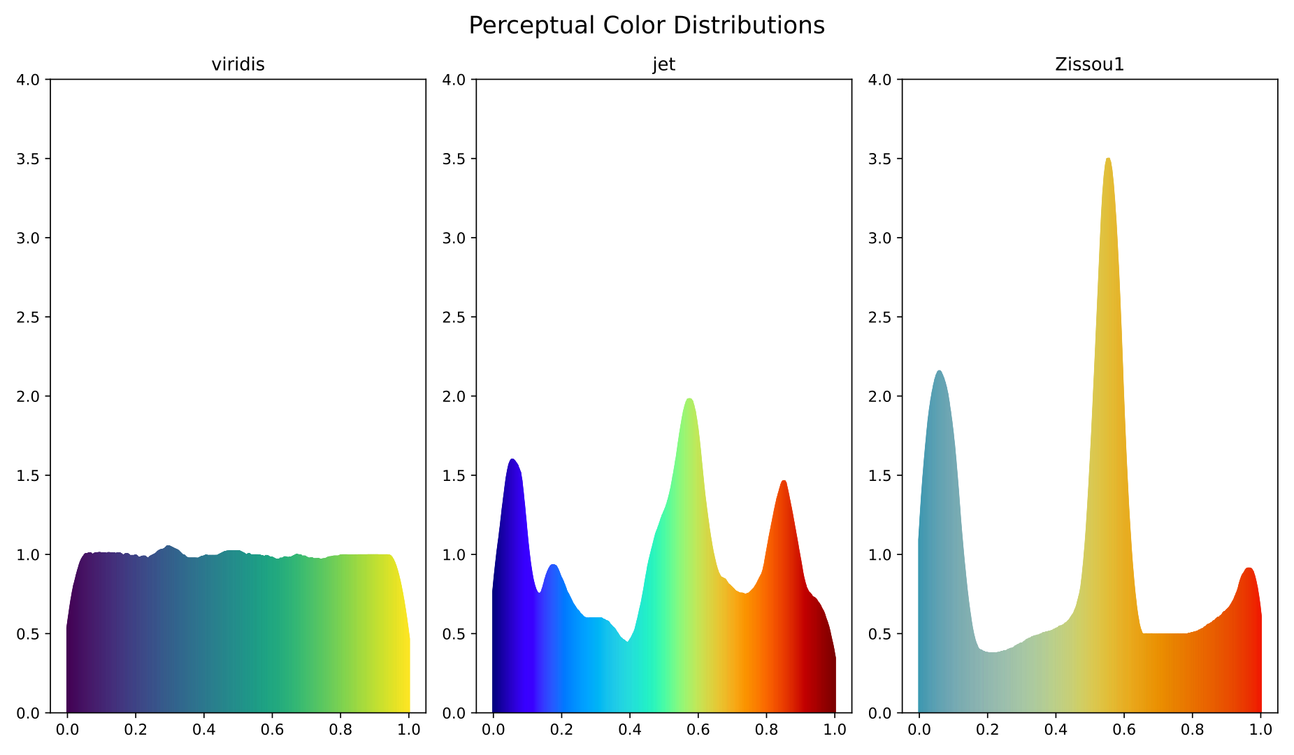
A plot displaying the "perceptual density" of three different colormaps, sampled from a uniform distribution. Due to the fact that computers and humans process colors differently, many popular colormaps are not "perceptually uniform", that is, they change colors more quickly or more slowly in different regions. Here, we sample uniformly on three colormaps, and then plot where these samples fall on that colormap corrected to be perceptually uniform (in the CIECAM02-UCS space). We plot the colormaps viridis (from matplotlib), jet (from MATLAB), and Zissou1 (from the wesanderson R package). Because viridis is designed with perceptual uniformity in mind, we see a uniform perceptual density. However, this is not the case for jet and Zissou1, making them poorly suited for data visualization.
Studies have shown that non-uniform colormaps lead to increased errors and reduced speed when making decisions based on data visualized with these colormaps. In recent years, MATLAB has changed its' default colormap from jet to parula, a viriidis-like colormap. However, the Zissou1 colormap is still commonly used in publications visualizing data in R. With this is mind, I have created a pull request to improve the colormap to improve the perceptual uniformity of the colormap.
